If one could distill a tuxedo into wristwatch form, no doubt it would resemble the Piaget Black Tie “Vintage Inspiration,” one of the brand’s most anticipated offerings at SIHH 2015 – and it didn’t disappoint when the ABTW team got their hands on it. True to its name, the Piaget Black Tie, like many of the most celebrated (and debated) watch releases in recent years, offers a new twist on a vintage model from the brand’s history. But how it contemporizes its retro inspiration in its choice of movement affects the nostalgic impact of what proves one of the most elegant dress-watch offerings we’ve seen this year.
Much of the hype around this 2015 Piaget – a very limited edition, with just 28 pieces made available for purchase – is that, allegedly, none other than iconically iconoclastic artist Andy Warhol favored the original ’70s model the Piaget Black Tie is based on. Indeed, when I showed it to a Swiss vintage-watch fanatic of a certain age, he blurted out “It’s very Studio 54!”
One can certainly imagine a celebrity like Warhol rocking such a timepiece to, say, openings at The Museum of Modern Art during the disco era. Like Warhol’s own work, the Piaget Black Tie proves ultimately a postmodern design amalgamation – re-appropriating style tropes from previous eras and reshaping them for a very “now” and breathtaking wrist statement.
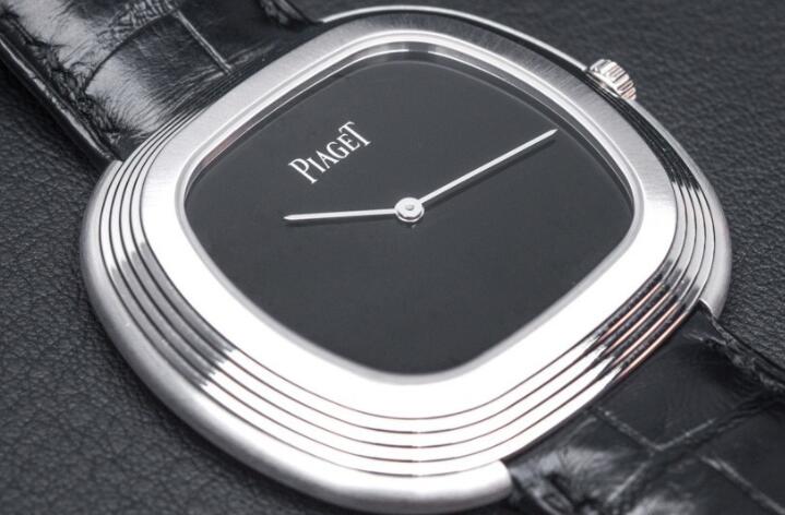
As such, both the original model and the new Piaget Black Tie tweak Art Deco aesthetics for modern tastes. The ’70s and ’80s proved a watershed for the Art Deco revival, with the period’s antiques, objets d’art, ceramics and, yes, watches proving most desirable and influential. The stepped-pyramid ridges of the Piaget Black Tie’s case, for example, prove a signature Deco touch – as does its wonderfully puzzling, sculptural case design, whose fluid, elegant geometry can’t decide whether it’s a circle or square.
What’s so cool about the Piaget is it merges that Deco sensibility with the vibe of another art movement dominant in the “me decade”: minimalism. The lack of adornment on the Piaget Black Tie makes, say, a Max Bill look like a Rolex Daytona Leopard! Next to it, a Movado Museum Watch looks decadent! Okay, those are wild exaggerations, but you get my drift: the Piaget Black Tie is one of the more successful stark offerings we’ve encountered of late in a flurry of deliberately unadorned timepieces.
Its expanse of white gold is exquisitely and subtly finished, more impressive, even, in person – alternating expertly brushed satin and polished surfaces as one would expect from an esteemed heritage manufacture like Piaget. The inky onyx dial, meanwhile, dramatically personifies the color of midnight. On that sleek monochrome face appears the Piaget Black Tie’s only non-abstracted form: the Piaget branding.
The Piaget Black Tie really does embody the definition of elegance – literally. Merriam-Webster defines “elegant” as both “of a high grade or quality,” and “simple and clever” – and that pretty much sums up what we have here. Anything that might have proven “extra” in the design department has been subtracted. Numbers? Nada. Index markers? Too decorative. Jeweling? Come on!
The result ends up being minimal, yet utterly formal; masculine, yes, but in a way that doesn’t scream “Dude!”in any way, shape, or form; glam, yet dead serious as a serious timepiece. It also manages to be a bit avant-garde, but classy (admittedly one of the worst adjectives in the English language, save coming out of the gape of Ron Burgundy). Most compelling is the bold contrast between the white gold case, jet-black dial, and absolutely spectacular, luxurious crocodile strap. That essential graphic quality vividly evokes – and certainly would wonderfully complement – a tux’s traditional black/white combo. Gazing at it longingly, one wonders whose wrist at this year’s Academy Awards is going to be rocking this. And that’s a nice chunky buckle pictured below, too, huh? Definitely not too dainty.
What’s truly interesting is how the Piaget Black Tie builds on its retro elements, revamping them for today’s tastes. Intriguingly for a vintage-inspired watch, the Black Tie’s diameter matches those of the original, which had a certainly ahead-of-its-time case size of 45 x 40mm. That’s a hefty, almost Panerai-sized piece of wrist real estate! Due to the ingenuity of the design, however, the Piaget Black Tie fits just right – neither too big or too small.
Personally, I often prefer more formal timepieces to land in the 36mm-39mm range. This model, though, proves among the most successful executions of a dress-style watch at such a scale. Its refreshing to have a larger size as such an appealing option, with a hefty serving of unexpected wrist presence. The original used a different crown – a kind of stylized carved Deco-style sunburst/flower – that exuded more personality, as opposed to the standard Piaget signed crown here; I definitely prefer the former. But the biggest difference between the original and the current version lies in the choice of mechanism.
The Piaget Black Tie houses Piaget’s cal. 534P – one of the manufacture’s wonderful automatic movements that shows up in its Emperador and Polo collections, with a vph of 21,600 and a (pretty basic at this point) 42-hour power reserve. While it has a bit of Geneva striping, some beveling and graining, and a few blued jewels here and there, among the Piaget engine options, the 534P is a more robust than visually seductive movement.
To that end, there is no exhibition case back, a feature I’m glad they skipped: I feel it would likely clash with the prevailing minimalist vibe of the rest of the watch. I actually kind of adore the screw-in case back on the Piaget Black Tie. If you flipped it around, it would make for a cool sportif variation – a Royal Oak given a disco remix, if you will…
In not many watch offerings would such a fine, in-house movement disappoint – but that’s where nostalgia for the actual original kicks in. The watch the Piaget Black Tie is based on featured not a mechanical movement, but the Beta 21 – a calibre that makes the term “high-end quartz” seem anything but an oxymoron à la “jumbo shrimp.” The Beta 21 was one of the most important quartz movements ever created – perhaps one of the most important movements, period, in horological history. It was conceived at the dawn of the “quartz crisis” in 1970, following one year after the emergence into the marketplace of the game-changing Seiko Astron. The Beta 21 came about as the result of a surprising group effort – the likes of which have never been repeated, but whose industrial impact would reverberate for decades after. For the Beta 21, a consortium of 20 top Swiss watch brands like Omega, Patek, IWC, and Rolex came together to create the ultimate quartz movement. Each brand shared its own distinct expertise in the manufacturing and design – down to splitting the responsibilities to forge the individual parts!
The idea was to beat the Japanese at their own game, and in that, the Beta 21 nearly succeeded. It was one of the most hyper-accurate movements ever created, losing mere seconds in the single digits over the course of a year. During a series of tests in 1967, the Beta 21 set records with an accuracy of 0.003 seconds per day, leaving the chronometers of the moment in the timekeeping dust. It also appeared quite attractive for a quartz calibre. Despite its electronic foundation, the Beta 21 (and its brother, the Beta 22) were intentionally finished with traditional Swiss elegance – something Seiko, Citizen et al hadn’t quite mastered at that point. In its seven year commercial existence between 1970 and 1977, the Beta 21 really proved itself as a crucial pivot of modern horology. It became the foundation for Rolex’s still wildly underrated Oysterquartz, and arguably paved the way for future innovations like Seiko’s Spring Drive movement.
While I would have been excited to see the Beta 21 inside the Piaget Black Tie’s husk of white gold, industrially, it might have been impossible to execute (and let’s face it, those of us who crave high-end quartz are a small cult compared to the mechanical fetishists among us – of which I’m one as well!). While “automatic” is currently shorthand for “luxury” as a result of said quartz crisis, the Beta 21 was playing on another level, and I wish it would have a retro revival like everything else these days!
Beyond its technological/engineering legacy, there is no denying the power of the Piaget Black Tie’s formality. It’s wonderful to have such a slightly more individual alternative to, say, a Calatrava-type model. The Piaget Black Tie represents the ne plus ultra of dress watches today – in a decidedly contemporary case diameter, with a stunning casing of precious metal and a sophisticated design sensibility that proves truly artful. What’s not to like, really? Everything inessential, after all, has been stripped away.
Now, Piaget allegedly has some versions in the chamber that feature different materials like yellow gold and dials in lurid, wild hues (“Piaget Neon Green Tie,” anyone?). While we’re psyched to see those variations hands on, too, the Piaget Black Tie really does feature a perfect balance of elements that seems hard to beat, high-end quartz or not. Even though we would’ve preferred a Beta 21 to provide the Piaget Black Tie’s heartbeat, we’re still glad Piaget has stepped up with what just might become a new/old classic of retro-futurism.